Number Sense
An interactive visualization that transforms abstract numbers into colorful, bouncing spheres


Published
- 7 min read
For the last couple of months I have been working on a small experiment.
We constantly encounter numbers that are important, impressive, or alarming, yet surprisingly difficult to understand. Our intuition breaks down quickly once values grow beyond everyday scales. Billions, trillions, astronomical distances, global energy consumption or historical timelines all become abstract noise.
How rich is David Beckham compared to the average American? How does that compare to Jeff Bezos? What happens when you put personal wealth next to the GDP of a country, the market cap of a company, or the energy usage of a household? Numbers like these are technically precise but cognitively opaque.
I wanted a way to make those comparisons playful, visual, and a little more intuitive.
That idea became Number Sense.

What is Number Sense?
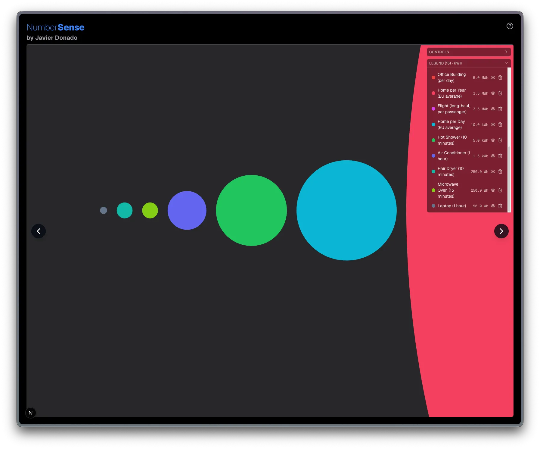
Number Sense is an interactive visualization tool where quantities turn into colorful bouncing balls. Their size reflects magnitude, and physics does the rest. Instead of reading tables or charts, you watch values collide, separate, and zoom in and out as you explore their relationships.
The goal is not academic accuracy. The goal is intuition.
If a comparison surprises you or makes you rethink a scale you thought you understood, then the experiment works.
Why this experiment exists
Humans are terrible at reasoning about scale. We evolved to compare objects in front of us, not trillion dollar economies or stellar diameters. The news and social media constantly bombards us with numbers that are, hopefully, technically accurate but often cognitively meaningless. We know that the US national debt is large, but how large is it? Policies are made based on these numbers, yet far too many of us lack a real sense of what they actually mean.
Traditional visualizations help, but many of them impose rigid structures. Bar charts and line charts force interpretation through axes. Number Sense removes most of that structure and focuses on spatial perception.
- Physics makes differences feel tangible.
- Motion keeps the comparison engaging.
- Scale becomes something you explore rather than something you read.
It works across domains:
- Physics
- Economy
- History
- Astronomy
- Energy consumption
- Population and time…
Almost anything measurable can be dropped into the canvas.
How comparisons work
Each value becomes a ball whose size reflects magnitude. You can mix sources freely and even combine values with different units. If you do, the legend will warn you with a red “Mixed” label, but the system does not block you.
You could argue that comparing stocks and flows, such as wealth and GDP, is conceptually messy, and that criticism is fair. Still, these comparisons can be surprisingly revealing. After all, most people instinctively compare their savings to their annual salary. In many countries, median wealth per person ends up closer to yearly income than one might expect, and placing both side by side often exposes relationships that would otherwise remain invisible.
Number Sense is intentionally permissive because, in this experiment, curiosity matters more than strict categorization.
Comparison mode
A guided comparison mode aligns the balls and lets you jump between them sequentially. It helps highlight ratios and differences without removing control. You can zoom and pan at any moment to see the broader context.
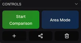
Area vs Diameter
There are two visual scaling modes:
- Area mode (default): values scale by area. This is mathematically consistent and works well for most domains such as money, time, or energy.
- Diameter mode: values scale linearly by diameter. This is useful when comparing actual object sizes such as planets or stars.
Diameter mode is intentionally niche. Most datasets become visually misleading if interpreted linearly. Stellar diameters, however, benefit from it because it mirrors how objects would appear if aligned in front of you. There is no volumetric comparison. When people say a million Earths fit inside the Sun, they are talking about volume. Number Sense shows what you would perceive from a distance in two dimensions.
Data sources and accuracy
The application includes multiple datasets pulled from public APIs and curated sources. Some numbers involve estimations, especially when dealing with energy consumption, waste generation, or aggregated economic values.
I tried to keep everything reasonable and internally consistent, but this project does not aim to be a definitive database. It is a tool for intuition.
If you notice incorrect values, I will gladly adjust them.
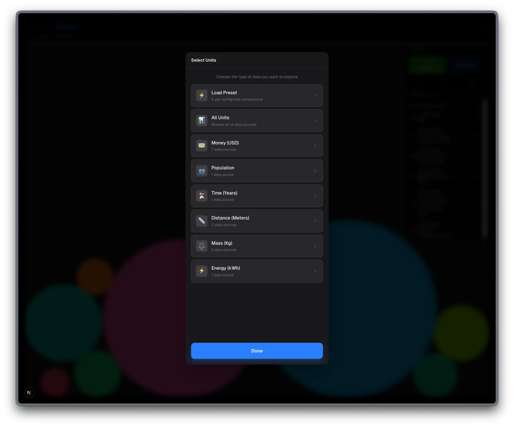
The datasets cover areas such as:
- Billionaires and market capitalization
- GDP and population
- Stellar diameters
- Historical time periods
- Energy production and waste…
Data fetching scripts and indexing pipelines are part of the project structure. See below a list of presets to get you started.
Custom values and sharing
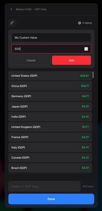
You can add your own values directly inside the interface. They are stored locally in your browser. Nothing is persisted on a server.
If you want to keep or share a setup:
- Use the share function.
- A base64-coded state will be added to your clipboard as a URL.
- Anyone opening that URL will see the exact same simulation.
This design keeps the experiment lightweight and avoids backend complexity.
Limitations and edge cases
The simulation spans extremely large numeric ranges, but it is still constrained by canvas resolution and floating point precision.
If you try to compare something microscopic with something astronomically large, the system might lose precision and balls can disappear. When that happens:
- Remove the largest or smallest value.
- Refresh the simulation.
The practical range is still wide enough to cover most interesting comparisons across disciplines. If you want to compare the entire universe, break it into chunks.
Technical overview
Number Sense is built as a modern web application focused on performance and responsiveness.
- Next.js with the App Router, deployed on Vercel
- TypeScript in strict mode
- Tailwind CSS for styling
- Matter.js as the physics engine
- React hooks with localStorage persistence
The physics layer is central to the experience. Matter.js provides collision handling, constraints, and motion that make differences in scale feel alive rather than static.
The project uses Next.js 16, React 19, and a lightweight testing setup with Vitest .
Final thoughts
Number Sense is an experiment, not a finished product. It sits somewhere between a toy, a visualization tool, and a thought experiment about scale.
If it makes you question how big, small, rich, distant, or powerful something actually is, then it has achieved its purpose. Let me know what you think in the comments!
Presets to explore
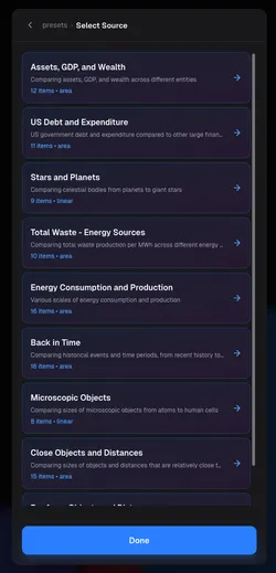
- Assets, GDP, and Wealth Jump from a median salary in Nigeria to Jeff Bezos, from a Porsche 911 to a fighter jet, and all the way up to the total value of all gold ever mined. This preset intentionally mixes everyday objects with global economics to expose how quickly financial scale explodes.
- US Debt and Expenditure Compare national debt, government spending categories, GDP, and personal benchmarks like income or house prices. Seeing military budgets and interest payments next to individual finances reframes political discussions in a more tangible way.
- Stars and Planets Start with Mercury and Earth, then move through Jupiter and the Sun until you reach giants like Betelgeuse and Deneb. Diameter mode makes stellar scale feel physical rather than abstract.
- Total Waste - Energy Sources Compare lifecycle waste from coal, gas, solar, nuclear, and wind alongside familiar references like a city bus or a human body weight. It challenges common assumptions about what “dirty” or “clean” really looks like numerically.
- Energy Consumption and Production Watch how a laptop or a hot shower sits next to a hospital, a nuclear power plant, or even the daily energy usage of entire countries. The contrast between personal habits and industrial scale is intentionally uncomfortable.
- Back in Time Move from the birth of the internet to the Big Bang in a single visual field. Historical intuition collapses when human history becomes a tiny dot next to geological and cosmic timescales.
- Microscopic Objects From hydrogen atoms and DNA strands to bacteria and human cells, this preset highlights how enormous biological structures are compared to atomic ones, even when everything feels “tiny”.
- Close Objects and Distances A deliberately mixed scale where people, city blocks, Everest, the ISS, planetary diameters, and even the distance to Mars coexist. It shows how quickly “close” stops meaning anything once astronomy sneaks in.
- Far Away Objects and Distances Leave human intuition behind entirely. From planetary orbits to light years, galaxies, and the Local Group itself, this preset demonstrates just how brutal astronomical scale becomes when visualized side by side.